Nov 11 2025.
views 171By Hafsa Rizvi
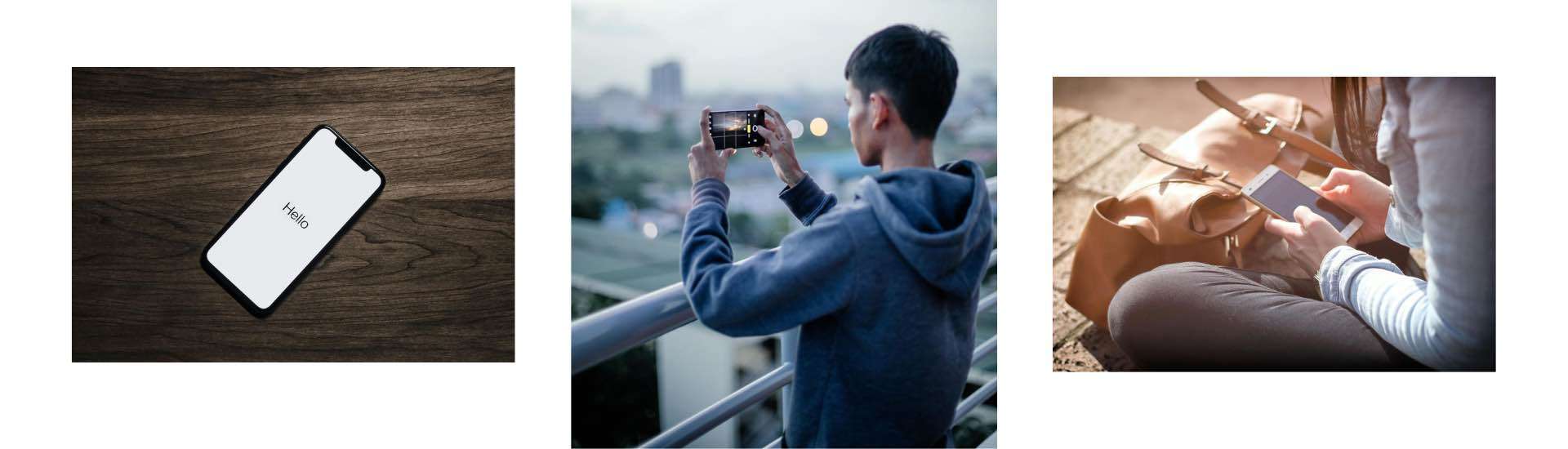
Every year on the second Thursday of November, the world observes World Usability Day. This year, it falls on November 14, 2025. But this isn't some technical celebration reserved for Silicon Valley engineers. It's a day that matters to anyone who has ever wanted to throw their phone across the room because an app refused to cooperate.
World Usability Day exists because technology has a problem. We live surrounded by devices and apps that are supposed to make life easier, yet many of them do exactly the opposite. They confuse us, frustrate us, and waste our time. This day asks a simple question: Shouldn't technology work for people, instead of people struggling to work with technology?
Usability is how easy and pleasant something is to use. You know good usability when you experience it, even if you've never heard the term. Think about how you send money through a mobile banking app. The best ones let you complete a transfer in seconds. You select a contact, enter an amount, confirm with your fingerprint, and done. No confusion, no manual, no calling the bank helpline.
That simplicity doesn't happen by accident. Behind those few taps are teams of designers who tested the app with actual people, watched where they got confused, and refined every screen until it felt natural.
Google Maps is another example that most people use daily. You type a destination, and it shows you how to get there with traffic updates, alternative routes, and estimated arrival times. Before apps like this existed, people spent hours with paper maps trying to figure out directions. Now we take this for granted, but it represents thousands of hours of work making complex technology feel simple.
Bad usability is everywhere, too. Consider government websites where finding a simple form requires clicking through a maze of pages. Or apps that force you to create an account before letting you see what they actually offer. Shopping websites that make you enter your address in rigid formats that don't match how Sri Lankan addresses actually work.
These aren't small annoyances. When the electricity bill payment system is confusing, people miss payments and face penalties. When hospital appointment systems are hard to navigate, patients give up and skip important checkups. When online job applications require twenty steps and crash halfway through, qualified people lose opportunities.
During the pandemic, many Sri Lankan schools shifted to online learning platforms. Some platforms worked beautifully, letting students see their lessons clearly and submit work easily. Others were disasters, with confusing layouts, broken links, and systems that only worked on expensive computers. The difference wasn't just technical capability but whether anyone had actually tested these systems with real teachers, students, and parents.
Designing usable technology in Sri Lanka presents unique challenges that many global companies never consider. Internet speeds vary dramatically across the country. Someone in Colombo might have fibre optic broadband, while someone in a rural area struggles with patchy mobile data. Apps that work perfectly on fast connections become unusable torture on slow ones.
Then there's the device problem. Not everyone carries a flagship smartphone. Many people use basic Android phones that are several years old. If your app only works smoothly on the latest Samsung or iPhone, you've excluded millions of potential users.
Language adds another layer. Sri Lanka operates in three languages, and many people mix all three in daily conversation. Technology that forces people into rigid language choices feels alien. The most successful local apps understand this reality and adapt to it.
The COVID-19 vaccine registration system actually got this right. Despite handling millions of registrations, it worked across different devices, loaded quickly even on slow connections, and offered clear instructions in multiple languages. That success came from thinking about real Sri Lankan users from the beginning, not as an afterthought.
Twenty years ago, using an ATM in Sri Lanka often meant standing there confused, trying to decipher cryptic abbreviations and small text. Modern ATMs from local banks now have clear touchscreens with large buttons, instructions in Sinhala, Tamil, and English, and transactions that follow logical steps. Elderly people who once needed help can now use them independently.
This transformation happened because banks finally invested in usability testing. They watched real customers use ATMs, saw where people hesitated or made mistakes, and redesigned the interfaces. The technology didn't get more advanced; it got more thoughtful.
Food delivery apps like PickMe Food and Uber Eats transformed how Sri Lankans order meals, but not because of revolutionary technology. Their success came from solving usability problems. Before these apps, ordering food meant phone calls where you tried to explain your address over bad connections, repeated your order multiple times, and had no idea when food would arrive.
Now you browse menus with photos, select what you want, the app already knows your address, and you watch your delivery approach on a map. Payment happens automatically. The complexity got hidden behind simple screens. That's what good usability does; it handles the complicated parts so you don't have to.
Making technology simple requires enormous effort. When WhatsApp lets you send a message with one tap, that simplicity represents hundreds of decisions about button placement, colour choices, font sizes, and response times. Engineers at Meta constantly test these features with thousands of users worldwide, including people with visual impairments, elderly users, and those with slow internet.
They learn that what seems obvious to a 25-year-old engineer in California confuses a 60-year-old shopkeeper in Kandy. Good design requires humility to accept that your assumptions are probably wrong and patience to test, revise, and test again.
Poor usability isn't just annoying; it's exclusionary. When government services move online, but the websites only work for tech-savvy young people with fast internet and new phones, everyone else gets left behind. When banks create apps that require perfect English literacy, they exclude customers who would benefit most from digital banking.
Accessibility is part of usability. Technology should work for people with visual or hearing impairments, those with limited hand mobility, and anyone whose abilities differ from what designers assumed. Features like text-to-speech, adjustable font sizes, and voice commands aren't special accommodations but essential design elements for truly usable technology.
Understanding usability changes how you interact with technology. When an app frustrates you, recognise that it's usually a design failure, not your failure. You're not "bad with technology" when a website confuses you with unclear navigation and buried information.
This awareness matters because it helps you choose better tools. The most popular apps aren't always the best designed. Sometimes a less flashy alternative works far better for your actual needs. Learning to evaluate usability helps you avoid wasting time on poorly designed systems.
For students considering careers, usability design is a growing field. It combines psychology, technology, and creativity. It requires understanding human behaviour, not just coding skills. As more Sri Lankan companies and government agencies recognise usability's importance, they need people who can bridge the gap between complex technology and real users.
Sri Lanka continues to digitise everything from education to healthcare to government services. How well this transformation serves people depends entirely on usability. Technology that only works for urban, wealthy, tech-savvy users leaves most of the country behind.
World Usability Day reminds us to demand better. When a government website is confusing, that's feedback they need to hear. When a bank app makes simple tasks complicated, customers should say so. When schools adopt learning platforms, teachers and students should insist on ones that actually work for them.
The best technology disappears into the background. You don't think about how Google search works; you just find what you need. You don't marvel at how WhatsApp sends messages; you just connect with people. That invisible simplicity is the goal of good usability design.
Next time you use an app or website, notice what makes it easy or frustrating. Notice when technology helps you accomplish something quickly versus when it becomes an obstacle requiring workarounds. That awareness is the first step toward demanding and eventually creating better technology for everyone.
Technology should adapt to people, not force people to adapt to technology. That's the simple idea behind World Usability Day, and it's worth remembering every day of the year.


0 Comments