Two months ago, designer architect Tilak Samarawickrema undertook an interior project for Interblocks (Pvt) Ltd, a software development company situated in Colombo. In this email interview with Life Online, Samarawickrema, speaks about carpet concept, reflecting also on his meticulously crafted tapestries and its discovery. Edited extracts from an email interview are below.
Tell us about your recent interior project.
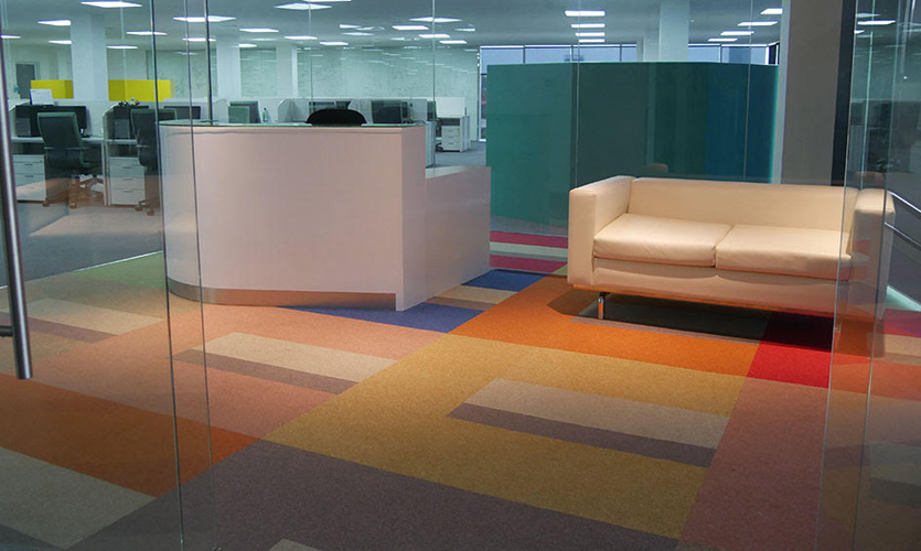
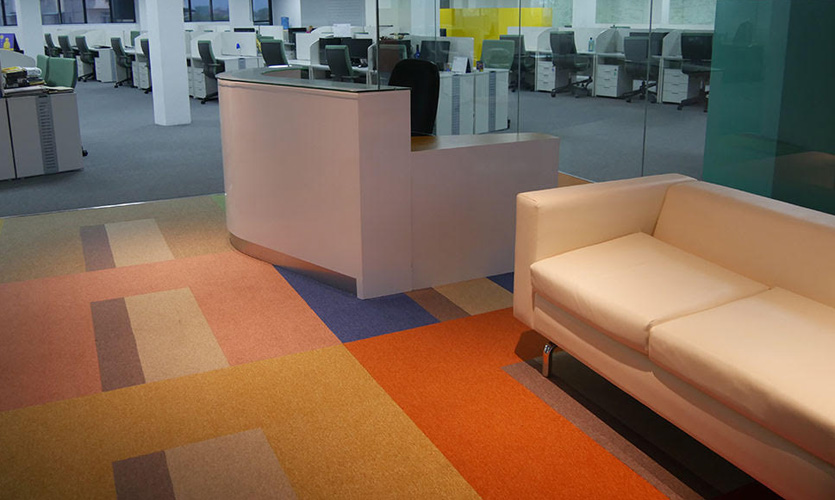
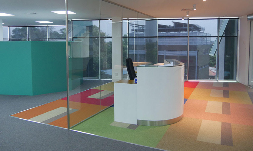
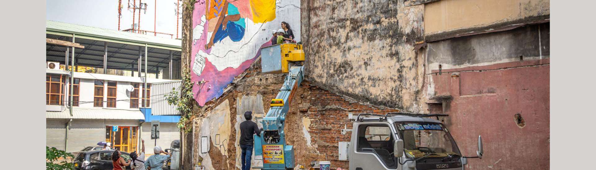
My interaction with Interblocks goes back to its inception when I designed their office interior in 2001. A colourful interior was the prerequisite then and so, a especially designed floor carpet at the reception area came to being. Yet again, fifteen years later, the company saw me introduce an open plan concept of an actual handwoven cotton tapestry (124 x 106cm) blown up and enlarged to 600 x 600cm to drape the entire floor of the reception area housing ninety workstations. These carpet tiles that were brought down from Korea closely matched the colour palette of my tapestries. The end result was an identical design of a hand-woven tapestry successfully transformed to a fixed floor carpet. The visual impact of this conversion on scale worked well in an architectural sense to complement my open plan design concept.
Guide us through your discovery of tapestry technique. Also, why did you pick it up as an aspect of your work?
The good twelve years spent in Milan, Italy enriched my involvement with crafts development as a consultant to the National Design Center (NDC). Here, I worked closely with Dumbara mat weavers of Henawela and before I returned to Sri Lanka looking for traditional cloth weavers, I spent time with indigenous weavers of Mayan origin in Guatemala as a UNICEF consultant.
Although my line drawings explore a curvilinear nature inspired by the Sinhalese calligraphy, my architectural training made me visualise and conceive geometric compositions. The nature and structure of the loom was also more inclined towards geometric patterning. The repetition of these elements were more consistent in application than the curved profile.
Soon, I collaborated with the master weaver, Yapage Sirisena and his three sons for production. Even though my designs were unfamiliar to them, they were quick to adapt and improvise. Within a short duration, the woven product was flown to the MoMA Design Store in New York where they carried for a period of eight years. As my tapestry designs evolved with time, they began to transform into a personalized and original aesthetic easily identified with my work.
Your art is often described as ‘sensual’ and sometimes ‘surrealistic.’ How does that process work?
One summer of 1978, I met Alberto Moravia (1907-1990) the Italian author of the novel la Romana (Woman of Rome) who explored modern sensuality in his writings. Upon seeing my animated film Andare, he inquired what I planned to do next. I said, “I hope to make an erotic film.” Moravia snapped back, “Tilak, why do you want to do that when this film is already erotic for me?” His personal response then, is an understanding that my drawings are curved lines similar to those in the Sinhala alphabet. The roundish nature of the lines often echo feminine sensuality such as breasts, buttocks, lips, navels etc. The surrealistic aspect of my drawings appears when I over-emphasize details such as hair, eyes, lips etc. As renowned Italian artist, Bruno Munari (1907-1998) once stated,
“This type of visual communication acts on the memory of the spectator, so that if Tilak suggests the head of an ox with a decorated horn and then depicts only a part of the back and then disappears, I see all the ox and I also know that it is decorated and so I can think of a festivity…” (1977)
The colour tones that you have chosen in your tapestries are warm, sensitive, and careful. Do they hold any significance?
My earlier colour palette were a synthesizing of the traditional dance costumes, temple murals and the Radical Italian design movement Memphis of the ‘70s and ‘80s. They comprised warm yellows to various tones taking a more minimalist and geometric form. At this stage, I began fusing the threads of yarn in different tones of the same colours. For instance, warm yellow threads were never solid colours but a concoction of other shades. At present, my entire colour palette makes up the threads of mixed coloured yarn. I hardly use primary colours. This not only gives my tapestries a warm tenor, but a juxtaposition of mixed coloured threads playing against each other, while softening the overall visual impact of the tapestry.
Design is a vigorous force. How do you feel about the transfer of your tapestry aesthetic to floor carpet tiles?
For the last fifty years I have pursued in multi-faceted design, architecture, line drawings, animation, crafts development, tapestry design, etc. Each field is distinct where a fair amount of time was dedicated to develop, promote and successfully market the product. The first time a tapestry of mine was made into a floor carpet was in 1994 when the Swiss company Mobelstofweberei produced two industrially woven floor carpets using the exact design of my tapestries. Launched in Switzerland and later marketed widely, they were Wilton woven 100% wool, pile carpets and were named after my wife and daughter. It’s a major transformation in addition to the fact that it’s a sprawling on the floor. My second attempt at Interblocks two months ago covering an even larger space with carpet tiles usage brings more joy as the visual impact is much greater in its grandeur.


0 Comments